malzariey/filament-daterangepicker-filter
| Install | |
|---|---|
composer require malzariey/filament-daterangepicker-filter |
|
| Latest Version: | 5.0.6 |
| License: | MIT |
| Last Updated: | Jun 21, 2026 |
| Links: | GitHub · Packagist |
Filament Date Range Picker and Filter


A native Alpine.js date range picker for Filament. Select date ranges, months, or years with support for presets, time selection, and full modal/slide-over compatibility.
Features
- 🗓️ Day, Month, or Year Picker - Choose the granularity that fits your needs
- ⌨️ Keyboard Input Support - Type dates directly with format validation
- 🎯 Modal Compatible - Dropdown teleports to body, solving z-index issues
- 🕐 Time Picker - Optional time selection with 12/24 hour format
- 🌍 Localization - Full i18n support via Day.js locales
- ♿ Accessible - Keyboard navigation and ARIA attributes
- 🎨 Native Filament UI - Seamlessly matches Filament v4 styling
Installation
composer require malzariey/filament-daterangepicker-filter
Publish translations (optional):
php artisan vendor:publish --tag="filament-daterangepicker-filter-translations"
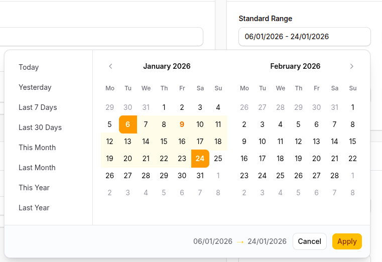
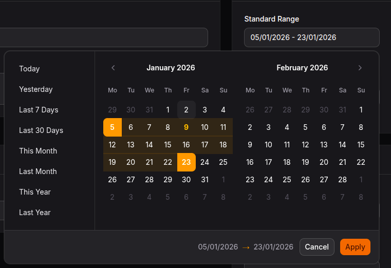
Screenshots
Light mode
Dark mode
Basic Usage
As a Field
use Malzariey\FilamentDaterangepickerFilter\Fields\DateRangePicker;

DateRangePicker::make('created_at'),
As a Filter
use Malzariey\FilamentDaterangepickerFilter\Filters\DateRangeFilter;

DateRangeFilter::make('created_at'),
Picker Type Modes
Day Picker (Default)
Select specific dates:
DateRangePicker::make('date_range')
    ->format('d/m/Y');
Month Picker
Select entire months. The popup header includes previous/next-year buttons and a compact numeric year input, so users can jump to a year without stepping one year at a time.
use Malzariey\FilamentDaterangepickerFilter\Fields\DateRangePicker;

DateRangePicker::make('billing_period')
    ->monthPicker()
    ->format('F Y');
Month picker mode also supports typed input. Pressing Enter applies the typed month value without falling through to day-picker selection behavior:
DateRangePicker::make('billing_period')
    ->monthPicker()
    ->singleCalendar()
    ->allowInput()
    ->format('m/Y');
Range input works with the configured separator:
DateRangePicker::make('billing_period')
    ->monthPicker()
    ->allowInput()
    ->format('m/Y');
Example input:
06/2026 - 08/2026
Month picker year options and disabled months respect minYear(), maxYear(), minDate(), and maxDate():
DateRangePicker::make('billing_period')
    ->monthPicker()
    ->format('m/Y')
    ->minYear(2020)
    ->maxYear(2030)
    ->minDate('2020-06-01')
    ->maxDate('2030-12-31');
Year Picker
Select entire years:
DateRangePicker::make('fiscal_years')
    ->yearPicker()
    ->format('Y')
    ->minYear(2020)
    ->maxYear(2030);
New Features
Keyboard Input
Allow users to type dates directly:
DateRangePicker::make('dates')
    ->allowInput(); // Enable keyboard entry with format validation
When allowInput() is enabled, pressing Enter while focused inside the input parses and applies the typed value first. Invalid partial input does not overwrite the previous valid selection unless the user clears the field.
Modal & Slide-Over Compatibility
The dropdown teleports to <body> by default to avoid z-index issues:
DateRangePicker::make('dates')
    ->teleport();      // Enabled by default

DateRangePicker::make('dates')
    ->teleport(false); // Disable if needed
Dual State Mode
Store start and end dates in separate Livewire properties:
DateRangePicker::make('date_range')
    ->useDualState('start_date', 'end_date');

// In your Livewire component:
public ?string $start_date = null;
public ?string $end_date = null;
Custom Events
The component dispatches custom events for integration with Livewire or JavaScript:
// Listen for date range changes
document.addEventListener('apply.daterangepicker', (e) => {
    console.log('Start:', e.detail.startDate);
    console.log('End:', e.detail.endDate);
    console.log('Formatted:', e.detail.formattedValue);
});

// Other available events
document.addEventListener('cancel.daterangepicker', (e) => { /* ... */ });
document.addEventListener('show.daterangepicker', (e) => { /* ... */ });
document.addEventListener('hide.daterangepicker', (e) => { /* ... */ });
| Event | Fired When |
|---|---|
apply.daterangepicker |
User clicks Apply or autoApply triggers |
cancel.daterangepicker |
User clicks Cancel or presses Escape |
show.daterangepicker |
Picker dropdown opens |
hide.daterangepicker |
Picker dropdown closes |
Configuration Options
Timezone
DateRangePicker::make('created_at')->timezone('UTC')
Start and End Dates
DateRangePicker::make('created_at')
    ->startDate(Carbon::now())
    ->endDate(Carbon::now())

// Or use shortcuts:
DateRangePicker::make('created_at')->defaultToday()
DateRangePicker::make('created_at')->defaultLast7Days()
DateRangePicker::make('created_at')->defaultThisMonth()
DateRangePicker::make('created_at')->defaultLastYear()
Min and Max Dates
DateRangePicker::make('created_at')
    ->minDate(Carbon::now()->subMonth())
    ->maxDate(Carbon::now()->addMonth())
First Day of Week
DateRangePicker::make('created_at')->firstDayOfWeek(1) // Monday
Time Picker
DateRangePicker::make('created_at')
    ->timePicker()
    ->timePicker24()       // Use 24-hour format
    ->timePickerSecond()   // Show seconds
    ->timePickerIncrement(30) // 30-minute increments
Auto Apply
DateRangePicker::make('created_at')->autoApply()
Single Calendar
DateRangePicker::make('created_at')->singleCalendar()
Disabled Dates
DateRangePicker::make('created_at')
    ->disabledDates(['2024-12-25', '2024-12-26'])
Display Format
Use PHP Carbon date format tokens. The JavaScript display format is auto-converted:
DateRangePicker::make('created_at')
    ->format('d/m/Y')      // Renders as DD/MM/YYYY in the browser

DateRangePicker::make('created_at')
    ->format('Y-m-d')      // Renders as YYYY-MM-DD in the browser

DateRangePicker::make('created_at')
    ->format('d M Y')      // Renders as DD MMM YYYY in the browser
Note: The deprecated
->displayFormat('DD/MM/YYYY')method still works but is no longer recommended. Use->format()with PHP Carbon tokens instead — the JavaScript display format is auto-converted.
Predefined Ranges
DateRangePicker::make('created_at')
    ->ranges([
        'Today' => [now(), now()],
        'This Week' => [now()->startOfWeek(), now()->endOfWeek()],
        'Last 30 Days' => [now()->subDays(30), now()],
    ])
Use Range Labels
Display preset labels instead of dates:
DateRangePicker::make('created_at')->useRangeLabels()
Disable Custom Range Selection
DateRangePicker::make('created_at')->disableCustomRange()
Drop and Open Directions
use Malzariey\FilamentDaterangepickerFilter\Enums\DropDirection;
use Malzariey\FilamentDaterangepickerFilter\Enums\OpenDirection;

DateRangePicker::make('created_at')
    ->drops(DropDirection::UP)
    ->opens(OpenDirection::CENTER)
Max Span
DateRangePicker::make('created_at')
    ->maxSpan(['months' => 1]) // days, months, or years
Week Numbers
DateRangePicker::make('created_at')
    ->showWeekNumbers()     // Localized week numbers
    ->showISOWeekNumbers()  // ISO week numbers
Day Picker Month/Year Dropdowns
Use showDropdowns() to show month and year dropdowns in the day picker header:
DateRangePicker::make('created_at')
    ->showDropdowns()
    ->minYear(2000)
    ->maxYear(2030)
Month picker mode always shows its own numeric year input in the popup header and uses the same year/date constraints.
Filter Options
Custom Query
use Malzariey\FilamentDaterangepickerFilter\Filters\DateRangeFilter;

DateRangeFilter::make('created_at')
    ->modifyQueryUsing(fn(Builder $query, ?Carbon $startDate, ?Carbon $endDate, $dateString) =>
        $query->when(!empty($dateString),
            fn(Builder $query) => $query->whereBetween('created_at', [$startDate, $endDate])
        )
    )
Filter Indicator
DateRangeFilter::make('created_at')->withIndicator()
Migration from v3.x and v4.x
Breaking Changes
- jQuery/Moment.js removed - The component now uses Alpine.js and Day.js
- Format tokens - Use
->format()with PHP Carbon tokens (e.g.d/m/Y). The JavaScript display format is auto-converted — there is no need to specify Day.js tokens manually.
New Methods
| Method | Description |
|---|---|
->monthPicker() |
Select months only |
->yearPicker() |
Select years only |
->allowInput() |
Enable keyboard date entry |
->teleport(bool) |
Control dropdown positioning (enabled by default) |
->useDualState(start, end) |
Store dates in separate properties |
->format('d/m/Y') |
Set date format using PHP Carbon tokens (auto-converts to JS) |
->pickerType(PickerType) |
Set picker granularity via enum |
Deprecated Methods
| Deprecated Method | Replacement | Since |
|---|---|---|
->displayFormat('DD/MM/YYYY') |
->format('d/m/Y') |
2.5.1 |
->setTimePickerOption() |
->timePicker() |
2.5.1 |
->setTimePickerIncrementOption() |
->timePickerIncrement() |
2.5.1 |
->setAutoApplyOption() |
->autoApply() |
2.5.1 |
->setLinkedCalendarsOption() |
->linkedCalendars() |
2.5.1 |
->getTimePickerIncrementOption() |
->getTimePickerIncrement() |
2.5.1 |
->getAutoApplyOption() |
->getAutoApply() |
2.5.1 |
->getLinkedCalendarsOption() |
->getLinkedCalendars() |
2.5.1 |
->getTimePickerOption() |
->getTimePicker() |
2.5.1 |
Credits
License
The MIT License (MIT). Please see License File for more information.
Acknowledgements
- Built with Alpine.js, Day.js, and Floating UI
- Special thanks to JetBrains for their support of open-source projects