sadam/livewire-range-slider
| Install | |
|---|---|
composer require sadam/livewire-range-slider |
|
| Latest Version: | v1.1.2 |
| PHP: | ^8.1 |
| License: | MIT |
| Last Updated: | Apr 8, 2026 |
| Links: | GitHub · Packagist |
Livewire Range Slider


A feature-rich, customizable range slider component for Laravel Livewire applications, built on noUiSlider with Alpine.js integration.
v1.1.0 - Added Livewire 4 compatibility, updated metadata and documentation. No breaking changes.
Upgrading from v0.10? This release includes significant improvements and breaking changes. Please read the Migration Guide before updating.
Compatibility: Supports Livewire v3 and v4.
Table of Contents
- Installation
- Requirements
- What's New
- Basic Usage
- Available Props
- Wire Model Modifiers
- Examples
- Configuration
- Custom Styling
- Keyboard Support
- Browser Support
- Migration Guide
- Credits
- License
- Support
Installation
Install via Composer:
composer require sadam/livewire-range-slider
Publish the assets:
php artisan vendor:publish --tag=livewire-range-slider-assets
⚠️ Note: The package won’t work properly without publishing these assets.
Optionally, publish the configuration file:
php artisan vendor:publish --tag=livewire-range-slider-config
Requirements
- PHP 8.1 or higher
- Laravel 10.x, 11.x, or 12.x
- Livewire 3.x or 4.x
What's New
This version introduces major improvements over the previous v0.10 release:
- Simplified Installation: No npm dependencies required - noUiSlider is now bundled
- Flexible Wire Models: Bind to single values or arrays (previously arrays only)
- Built-in Themes: 12 color themes out of the box (see Themes)
- New Features: Tooltips, pips, sizes, variants, RTL support, and more
- Configuration File: Set project-wide defaults (see Configuration)
- Improved Keyboard Support: Better debouncing and performance (see Keyboard Support)
For existing users: Please see the Migration Guide below for detailed upgrade instructions.
Basic Usage
Single Value Slider
<x-range-slider
    wire:model.live="price"
    :min="0"
    :max="1000"
    :step="10"
/>
class PriceFilter extends Component
{
    public $price = 500;
}
See Wire Model Modifiers for more options like wire:model.live and wire:model.blur.
Range Slider (Multiple Handles)
<x-range-slider
    wire:model="priceRange"
    :min="0"
    :max="1000"
/>
class PriceFilter extends Component
{
    public $priceRange = [200, 800];

    // You can also use 3+ handles
    // public $quartiles = [100, 300, 600, 900];
}
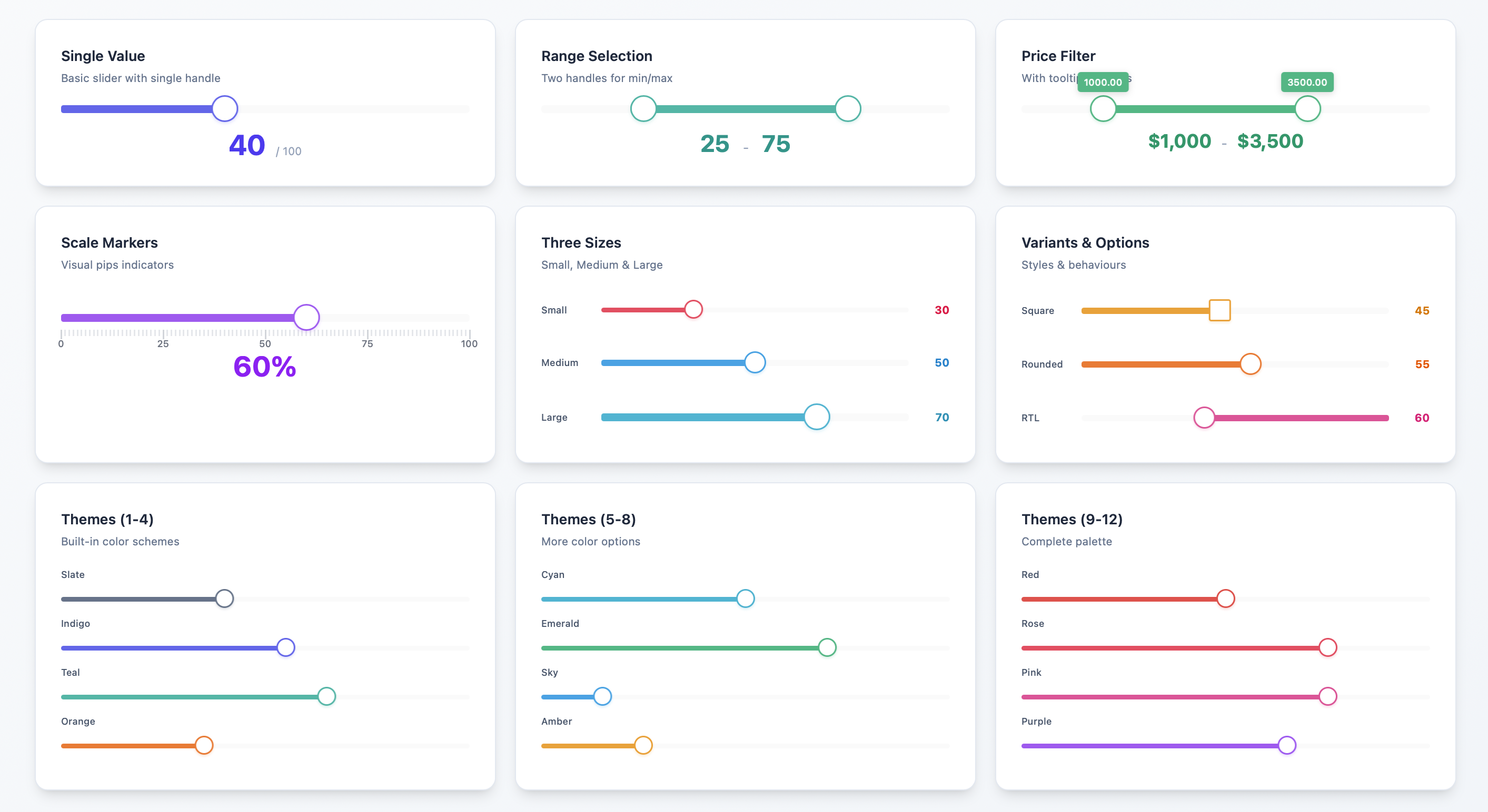
Available Props
| Prop | Type | Default | Description |
|---|---|---|---|
min |
int/float | 1 | Minimum value |
max |
int/float | 100 | Maximum value |
step |
float | 1 | Step increment |
values |
array | null | Selectable values |
tooltips |
bool | true | Show value tooltips |
pips |
bool/array | false | Show scale markers |
theme |
string | 'indigo' | Color theme |
size |
string | 'medium' | Slider size |
variant |
string | 'rounded' | Handle shape |
direction |
string | 'ltr' | Slider direction |
behaviour |
string | 'tap' | Interaction behavior |
Themes
Available themes: slate, indigo, teal, orange, cyan, emerald, sky, amber, red, rose, pink, purple
<x-range-slider wire:model="value" theme="emerald" />
See more examples in the Examples section.
Sizes
Available sizes: small, medium, large
<x-range-slider wire:model="value" size="large" />
Variants
Available variants: square, rounded
<x-range-slider wire:model="value" variant="square" />
Pips (Scale Markers)
Show evenly distributed markers:
<x-range-slider wire:model="value" :pips="true" />
Show markers at specific values:
<x-range-slider wire:model="value" :pips="[0, 25, 50, 75, 100]" />
Behaviour
Controls slider interaction. Common values:
tap- Click to set valuedrag- Drag handles onlytap-drag- Both tap and dragsnap- Snap to stepsfixed- Maintain handle distance
See noUiSlider documentation for all options.
<x-range-slider wire:model="value" behaviour="snap" />
Values
Set specific selectable range values
<x-range-slider wire:model="value" :values=[10, 50, 75, 100] />
Wire Model Modifiers
Live Updates
Update on every change (optimized - only fires after drag ends):
<x-range-slider wire:model.live="price" />
Blur Updates
Update when handle loses focus:
<x-range-slider wire:model.blur="price" />
Deferred Updates
Update when form is submitted (default):
<x-range-slider wire:model="price" />
Examples
Price Filter with Theme
<div>
    <x-range-slider
        wire:model.live="priceRange"
        :min="0"
        :max="5000"
        :step="50"
        theme="indigo"
        size="medium"
        :pips="[0, 1000, 2500, 5000]"
        :tooltips="true"
    />

    <p>Price: ${{ $priceRange[0] }} - ${{ $priceRange[1] }}</p>
</div>
Volume Control
<x-range-slider
    wire:model="volume"
    :min="0"
    :max="100"
    :step="1"
    theme="purple"
    size="small"
    behaviour="snap"
/>
Age Range Selector
<x-range-slider
    wire:model="ageRange"
    :min="18"
    :max="100"
    :step="1"
    :tooltips="true"
    :pips="true"
    theme="teal"
    variant="square"
/>
Configuration
Customize default values by editing config/livewire-range-slider.php:
return [
    'theme' => 'indigo',
    'size' => 'medium',
    'variant' => 'rounded',
    'direction' => 'ltr',
    'behaviour' => 'tap',
    'pips' => false,
    'step' => 1,
    'min' => 1,
    'max' => 100,
    'tooltips' => true,
];
See how to publish the configuration file in the Installation section.
Custom Styling
You can customize the published public/vendor/livewire-range-slider/range-slider.css file directly.
See available theme options
Keyboard Support
The slider fully supports keyboard navigation:
- Arrow keys to adjust values
- Tab to switch between handles (for range sliders)
- Optimized debouncing for keyboard input to reduce server requests
Browser Support
Supports all modern browsers that support Alpine.js and noUiSlider.
Migration Guide
Upgrading from Previous Version (v0.10)
This guide will help you migrate from the previous v0.10 version to the current release.
Overview of Changes
Major Improvements:
- No npm Required: noUiSlider is now bundled - no need to install via npm or modify
app.js - Simplified Wire Model: Can now bind to single values OR arrays (previously required arrays only)
- Built-in Theming: 12 color themes out of the box (previously required manual CSS)
- Configuration File: Set project-wide defaults
- New Features: Tooltips, pips (scale markers), sizes, variants, RTL support, and customizable behaviour
- Better Developer Experience: Comprehensive prop validation and sensible defaults
Breaking Changes:
- Asset management changed - must publish assets
- Wire model now accepts single values or arrays (previously arrays only)
- Minimum PHP version is now 8.1
- Component props expanded from 3 to 11
Step-by-Step Migration
Step 1: Clean Up npm Installation
If you installed noUiSlider manually for the old version, remove it:
# Remove from package.json
npm uninstall nouislider
Remove the imports from resources/js/app.js:
// DELETE THESE LINES:
import noUiSlider from 'nouislider';
import 'nouislider/dist/nouislider.css';
window.noUiSlider = noUiSlider;
Rebuild your assets:
npm run build
Step 2: Publish Package Assets
The new version bundles noUiSlider and publishes it to your public directory:
php artisan vendor:publish --tag=livewire-range-slider-assets
This creates:
public/vendor/livewire-range-slider/nouislider.min.jspublic/vendor/livewire-range-slider/nouislider.min.csspublic/vendor/livewire-range-slider/range-slider.css
Step 3: Update Component Properties
For Single Value Sliders
Before:
public $values = [50]; // Had to be an array
<x-range-slider :min="0" :max="100" :step="1" wire:model="values" />
After:
public $price = 50; // Can now be a single value
<x-range-slider :min="0" :max="100" :step="1" wire:model="price" />
For Range Sliders
Before:
public $values = [30, 70];
<x-range-slider :min="0" :max="100" :step="1" wire:model="values" />
After (same, but with optional enhancements):
public $priceRange = [30, 70];
<x-range-slider
    wire:model="priceRange"
    :min="0"
    :max="100"
    :step="1"
    theme="indigo"
    :tooltips="true"
/>
Step 4: Replace Custom CSS with Themes (Optional)
Before - You had to write custom CSS:
.noUi-target {
    background-color: #8BC34A;
    height: 12px;
    border-radius: 6px;
}

.noUi-handle {
    background-color: #212121;
    border: 2px solid #FFEB3B;
}

.noUi-connect {
    background-color: #FFEB3B;
}
After - Use built-in themes:
<x-range-slider wire:model="price" theme="emerald" size="medium" />
Available themes: slate, indigo, teal, orange, cyan, emerald, sky, amber, red, rose, pink, purple
Step 5: Use New Features (Optional)
Add tooltips:
<x-range-slider wire:model="price" :tooltips="true" />
Add scale markers:
<!-- Evenly distributed -->
<x-range-slider wire:model="price" :pips="true" />

<!-- At specific values -->
<x-range-slider wire:model="price" :pips="[0, 25, 50, 75, 100]" />
Choose a size:
<x-range-slider wire:model="price" size="large" />
Choose a variant:
<x-range-slider wire:model="price" variant="square" />
Step 6: Publish Configuration (Optional)
Set project-wide defaults:
php artisan vendor:publish --tag=livewire-range-slider-config
Edit config/livewire-range-slider.php:
return [
    'theme' => 'indigo',
    'size' => 'medium',
    'variant' => 'rounded',
    'tooltips' => true,
    'pips' => false,
    // ... more options
];
Comparison Table
| Feature | Old Version | New Version |
|---|---|---|
| Installation | npm install + app.js config | Just publish assets |
| Wire Model | Arrays only ($values = [50]) |
Single value or array |
| Props | 3 (min, max, step) | 11 (see Available Props) |
| Themes | Manual CSS required | 12 built-in themes |
| Tooltips | Manual CSS required | Built-in prop |
| Pips | Not available | Built-in prop |
| Sizes | Not available | small, medium, large |
| Configuration | Not available | Config file support |
| PHP Version | Any | 8.1+ |
Complete Example
Before:
// Component
public $values = [200, 800];
<x-range-slider :min="0" :max="1000" :step="10" wire:model="values" />
/* Custom CSS required */
.noUi-target { background-color: #8BC34A; }
.noUi-handle { background-color: #212121; }
.noUi-connect { background-color: #FFEB3B; }
After:
// Component
public $priceRange = [200, 800];
<x-range-slider
    wire:model.live="priceRange"
    :min="0"
    :max="1000"
    :step="10"
    theme="emerald"
    size="medium"
    :tooltips="true"
    :pips="[0, 250, 500, 750, 1000]"
/>
No CSS required!
Troubleshooting
Slider Not Appearing
Make sure you published the assets:
php artisan vendor:publish --tag=livewire-range-slider-assets --force
See the Installation section for more details.
Old Styles Conflicting
If you have custom CSS from the old version, it might conflict with the new themes. Either:
- Remove your custom CSS and use built-in themes (see Available Props)
- You can customize the published
public/vendor/livewire-range-slider/range-slider.cssfile directly. See available theme options
Wire Model Not Working
Make sure you're using the correct binding:
- Single value:
public $price = 50; - Range:
public $range = [20, 80]; - Multiple handles:
public $values = [10, 30, 60, 90];
See Basic Usage for examples.
Credits
Built with:
License
MIT License. See LICENSE for details.